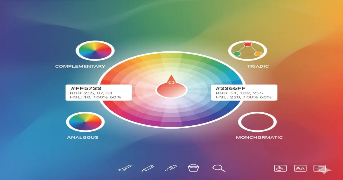
Color Picker Ultimate Guide: Master Color Theory for Web Design 2025
Master color theory and selection for stunning web designs. Learn HEX, RGB, HSL codes, color harmony principles, accessibility guidelines, and professional palette creation techniques that drive user engagement.

Understanding Color Systems and Formats
Color theory forms the foundation of effective web design. In 2025, understanding different color formats and systems is essential for creating visually appealing, accessible, and brand-consistent designs.
Our Color Picker Tool supports all major color formats and provides professional-grade color selection capabilities for designers and developers.
HEX, RGB, and HSL: Color Format Comparison
Each color format serves different purposes in web design and development:
Color Format Breakdown:
- HEX (#FF0000): 6-character hexadecimal notation, most common in CSS and web design
- RGB (255, 0, 0): Red, Green, Blue values from 0-255, ideal for screen displays
- HSL (0, 100%, 50%): Hue, Saturation, Lightness - intuitive for color adjustments
- RGBA/HSLA: Includes alpha transparency channel for layering effects
- CMYK: Cyan, Magenta, Yellow, Black - used primarily for print design
Pro Tip: Use HSL when creating color variations (lighter/darker shades) as it provides intuitive lightness control.
Color Harmony and Combination Theory
Creating harmonious color schemes requires understanding color relationships on the color wheel:
Essential Color Harmony Rules
Proven Color Combinations:
- Complementary: Opposite colors (blue + orange) for high contrast
- Analogous: Adjacent colors (blue + green + purple) for harmony
- Triadic: Three equally spaced colors for vibrant balance
- Split-Complementary: Base color + two adjacent to its complement
- Monochromatic: Single hue with varying saturation/lightness
- Tetradic: Four colors forming rectangle on color wheel
Popular Web Design Color Schemes 2025
- Navy + Coral: Professional yet approachable
- Forest Green + Gold: Luxury and sustainability
- Deep Purple + Mint: Modern and fresh
- Charcoal + Bright Blue: Corporate and trustworthy
Color Psychology in Design
Colors evoke emotional responses and influence user behavior, making color psychology crucial for effective design:
Warm Colors
- Red: Urgency, passion, energy, calls-to-action
- Orange: Enthusiasm, creativity, affordability
- Yellow: Optimism, clarity, attention-grabbing
Cool Colors
- Blue: Trust, stability, professionalism
- Green: Growth, nature, harmony, money
- Purple: Luxury, creativity, innovation
Brand Color Strategy
Choose colors that align with your brand personality and target audience emotions. Tech companies favor blues, eco-brands use greens, while luxury brands prefer purples and blacks.
Accessibility and Color Contrast
Designing inclusive experiences requires attention to color accessibility and contrast ratios:
WCAG Color Guidelines
Contrast Requirements:
- Normal text: Minimum 4.5:1 contrast ratio
- Large text (18pt+): Minimum 3:1 contrast ratio
- AAA compliance: 7:1 for normal text, 4.5:1 for large text
- Non-text elements: 3:1 for UI components and graphics
Colorblind-Friendly Design
Accessibility Best Practices:
- Don't rely solely on color to convey information
- Use patterns, textures, or icons alongside colors
- Test with colorblind simulators during design phase
- Ensure sufficient brightness differences between colors
- Provide alternative ways to distinguish elements
Professional Color Palette Creation
Building effective brand and design color palettes requires systematic approach and testing:
Step-by-Step Palette Development
Professional Process:
- Define brand personality: Identify emotional goals and target audience
- Choose primary color: Select main brand color reflecting core values
- Add secondary colors: 2-3 supporting colors using harmony rules
- Include neutrals: Grays, whites, blacks for balance and text
- Test accessibility: Verify contrast ratios and readability
- Create variations: Light, medium, dark versions of each color
- Document guidelines: Specify usage rules and contexts
Colors for Different Industries
Industry conventions and user expectations influence optimal color choices:
Technology
Healthcare
Food & Dining
Color Trends and Future Predictions
Staying current with color trends helps maintain modern, relevant designs:
2025 Color Trends
Trending Color Directions:
- Digital Nature: Cyber greens and bio-inspired hues
- Warm Minimalism: Soft beiges and warm grays
- Electric Brights: Neon accents for digital interfaces
- Sustainable Palette: Earth tones and natural colors
- AI-Inspired: Gradient combinations and chromatic shifts
Frequently Asked Questions
Related Articles
How to Use Color Picker Ultimate Guide
- Input Data: Enter or paste your data into the input field.
- Process: The tool will automatically process your input or click the action button.
- View Results: See the results instantly and copy them if needed.
Common Use Cases
Professional Use
Perfect for developers, designers, and digital marketers who need quick results.
Education
Great for students and teachers for learning and verification.
Personal Projects
Simplify your personal tasks with this easy-to-use tool.
Everyday Tasks
Save time on routine calculations and conversions.
Learn More About Color Picker Ultimate Guide
A free online Color Picker Ultimate Guide tool.
This tool is designed to be simple, fast, and effective. Whether you are a professional or just need a quick solution, Color Picker Ultimate Guide is here to help. We continuously update our tools to ensure accuracy and better user experience.
Related Tools
Word Counter
Count words, characters, sentences, and paragraphs in your text.
HTML to Markdown
Convert HTML code to Markdown format for easier editing.
Character Counter
Count characters, words, and lines in your text with real-time statistics.
Running Pace Calculator
Calculate running pace, distance, and time for workout planning.