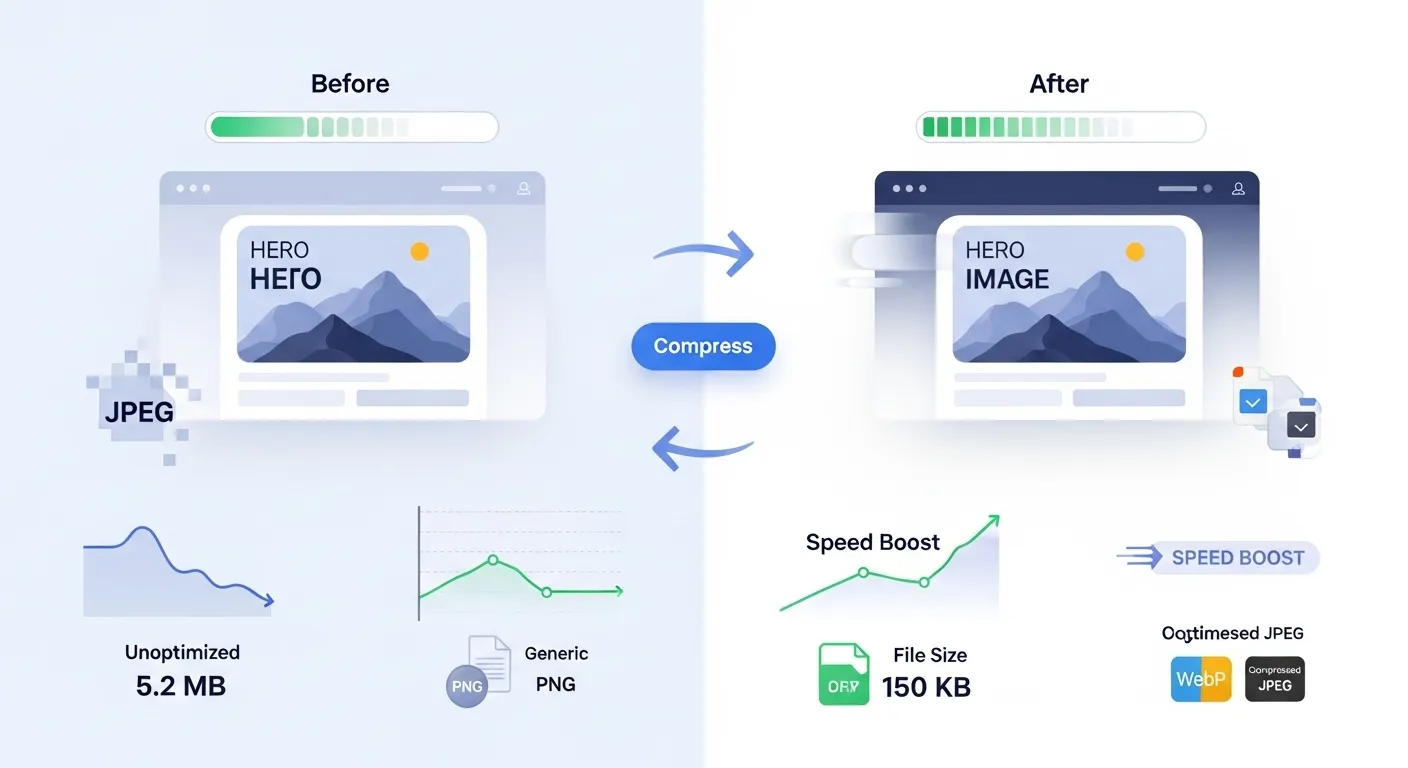
Optimizing Images for Web Performance
Master the art of image optimization to create faster, more efficient websites

Why Web Image Optimization Matters
Images typically account for 60-70% of a website's total file size. Proper optimization can dramatically improve loading speeds, user experience, and search engine rankings while reducing bandwidth costs.
Faster Loading
Optimized images load 50-80% faster
Better SEO
Page speed is a Google ranking factor
Better UX
Users stay longer on fast-loading sites
Core Optimization Techniques
1. Compression Optimization
Reduce file sizes without significantly impacting visual quality.
JPEG Compression Guidelines:
| Quality Level | Use Case | File Size Reduction |
|---|---|---|
| 90-100% | Professional photography, print | 10-20% |
| 70-89% | Web images, social media | 40-60% |
| 50-69% | Thumbnails, previews | 70-80% |
2. Proper Sizing
Never use CSS to resize images. Always resize images to their display dimensions.
❌ Wrong Approach
<img src="large-image-2000x1500.jpg"
     style="width: 300px; height: 225px;">
Downloads 2000x1500 image but displays at 300x225
✅ Correct Approach
<img src="optimized-image-300x225.jpg"
     alt="Description">
Image is already sized correctly for display
- • Hero images: 1920x1080 (desktop), 768x432 (mobile)
- • Blog thumbnails: 400x300 or 300x200
- • Product images: 600x600 or 800x800
- • Profile pictures: 150x150 or 200x200
3. Modern Format Implementation
Use modern formats like WebP and AVIF with proper fallbacks for maximum compression efficiency.
Format Efficiency Comparison:
Implementation Example:
<picture>
  <source srcset="image.avif" type="image/avif">
  <source srcset="image.webp" type="image/webp">
  <img src="image.jpg" alt="Description" loading="lazy">
</picture>
4. Lazy Loading
Load images only when they're about to enter the viewport to improve initial page load speed.
Native Lazy Loading
<img src="image.jpg"
     loading="lazy"
     alt="Description">
Supported in modern browsers (95%+)
JavaScript Fallback
<img data-src="image.jpg"
     class="lazy"
     alt="Description">
Use Intersection Observer API for older browsers
Responsive Images
Serve different image sizes based on the user's device and screen resolution to optimize performance across all devices.
Using srcset for Different Screen Densities
<img src="image-400w.jpg"
     srcset="image-400w.jpg 400w,
             image-800w.jpg 800w,
             image-1200w.jpg 1200w"
     sizes="(max-width: 768px) 100vw,
            (max-width: 1200px) 50vw,
            33vw"
     alt="Responsive image">
How it works:
- srcset: Provides multiple image options with their widths
- sizes: Tells the browser how much space the image will take
- Browser: Automatically selects the best image for the device
Art Direction with Picture Element
<picture>
  <source media="(max-width: 768px)"
          srcset="mobile-image.jpg">
  <source media="(max-width: 1200px)"
          srcset="tablet-image.jpg">
  <img src="desktop-image.jpg" alt="Art directed image">
</picture>
Use when you need different crops or compositions for different screen sizes.
Advanced Optimization Techniques
Remove Metadata
Strip EXIF data and other metadata to reduce file sizes.
- • Camera settings
- • GPS coordinates
- • Color profiles
- • Thumbnails
Optimize Color Palette
Reduce the number of colors in images when possible.
- • PNG: Reduce to 256 colors or less
- • GIF: Use optimized palettes
- • JPEG: Adjust color sampling
Smart Cropping
Focus on the important parts of images and crop unnecessary areas.
- • Remove empty spaces
- • Focus on subjects
- • Maintain aspect ratios
- • Consider mobile viewing
CDN Optimization
Use Content Delivery Networks for faster image delivery.
- • Global edge servers
- • Automatic format conversion
- • Real-time optimization
- • Caching benefits
Performance Monitoring
Core Web Vitals Impact
LCP
Largest Contentful Paint
FID
First Input Delay
CLS
Cumulative Layout Shift
Testing Tools
| Tool | What It Measures | Best For |
|---|---|---|
| Google PageSpeed Insights | Core Web Vitals, performance score | Overall performance analysis |
| GTmetrix | Detailed waterfall charts | Identifying specific bottlenecks |
| WebPageTest | Multi-location testing | Global performance testing |
| Our Page Speed Checker | Quick performance overview | Regular monitoring |
Optimization Workflow
Step-by-Step Process
Analyze Current Images
Audit your website to identify large, unoptimized images
Resize to Display Dimensions
Use our Image Resizer to match display sizes
Choose Optimal Format
JPEG for photos, PNG for graphics, WebP for modern browsers
Compress Images
Use our Image Compressor to reduce file sizes
Implement Responsive Images
Use srcset and sizes attributes for different screen sizes
Add Lazy Loading
Implement loading="lazy" for below-fold images
Test and Monitor
Use performance tools to measure improvements
Common Mistakes to Avoid
Optimization Pitfalls
- Over-compression: Sacrificing too much quality for file size
- Wrong format choice: Using PNG for photos or JPEG for graphics
- Ignoring mobile: Not optimizing for mobile devices
- Missing alt text: Forgetting accessibility and SEO benefits
- No lazy loading: Loading all images immediately
- Single size fits all: Not using responsive images
- Ignoring modern formats: Not implementing WebP/AVIF
- No performance monitoring: Not measuring optimization impact
Free Optimization Tools
Conclusion
Web image optimization is a crucial skill for modern web development. By implementing proper compression, sizing, format selection, and loading strategies, you can significantly improve your website's performance and user experience.
Optimization Checklist:
- Resize to display dimensions
- Choose appropriate format
- Compress with optimal quality
- Implement lazy loading
- Use responsive images
- Add modern format fallbacks
- Remove unnecessary metadata
- Monitor performance impact
How to Use Optimizing Images For Web
- Input Data: Enter or paste your data into the input field.
- Process: The tool will automatically process your input or click the action button.
- View Results: See the results instantly and copy them if needed.
Frequently Asked Questions
Learn More About Optimizing Images For Web
A free online Optimizing Images For Web tool.
This tool is designed to be simple, fast, and effective. Whether you are a professional or just need a quick solution, Optimizing Images For Web is here to help. We continuously update our tools to ensure accuracy and better user experience.